Guest @ 18.223.107.149
Register

Donation


Donate Towards BK`s Servers

Please Donate to Help Keep BKs game server up and running Donate

Server

 
Recent Topics Prev 7   Next 7
Forum
Author
Replies
Last Post
0
Thu Apr 18, 2024 1:12 am
Natb1 View latest post
1
Sat Apr 13, 2024 2:43 pm
Natb1 View latest post
3
Thu Apr 11, 2024 1:10 am
Snap71 View latest post
3
Mon Apr 08, 2024 12:51 am
Luke View latest post
6
Wed Apr 03, 2024 4:42 pm
Natb1 View latest post
5
Sat Mar 30, 2024 7:33 pm
Luke View latest post
5
Sun Mar 24, 2024 8:57 pm
agmaas View latest post

stuck

Joined: Aug 19, 2010
Posts: 391
Posted: Fri May 25, 2012 7:13 am
im stuck on this sig as what to do with it......i think its "to clean" lookin and i dont no what else to do with it.........comments/suggestions


Joined: Mar 03, 2011
Posts: 1909
Location: Las Vegas, NV
Posted: Fri May 25, 2012 3:29 pm
try this,

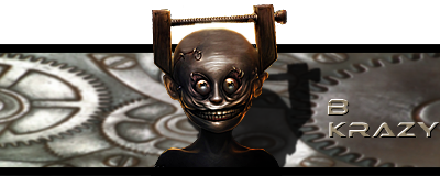
Move the guy over so that he is in the left third of the picture.
Center the "B KRAZY" in the right third.
Sharpen, darken, and put more contrast in the backgraound.
(and maybe lighten the guy just a hair to show some definition in the lower part)

To my eye, the guy is really sharp but the background is too blurry. the gears should be nice and sharp.

Thats what I think if its worth anything.

But you always do great work!!!


PEOPLE FEAR.........what they dont understand.
Joined: Aug 11, 2009
Posts: 2530
Posted: Fri May 25, 2012 5:09 pm
You need a new background. Get rid of the shadow behind the thing... Do something different with the border, and maybe try something without the alpha channel.


___________Fireteam Zulu | Graphics Team Leader | SFC____________


Joined: Nov 17, 2010
Posts: 1914
Location: PA
Posted: Fri May 25, 2012 6:35 pm
Kreacher, give this a try for the background:


Cheers!
Kula


Joined: Aug 19, 2010
Posts: 391
Posted: Fri May 25, 2012 7:34 pm
ok ill mess with all those ideas......as for the alpha channel the only real reason i ever use it is because im not really making sigs for anyone and ALOT of time the dang image get so small by the time it fits into the 120 height lol....the guy is really cool looking but when he gets down to size he looses his look


Joined: Aug 11, 2009
Posts: 2530
Posted: Fri May 25, 2012 7:38 pm
Yeah man, it's unfortunate. Perhaps try a 400x150 pixel size. The only reason is that he really doesn't seem like the alpha channel type... lol


___________Fireteam Zulu | Graphics Team Leader | SFC____________


All times are UTC [DST enabled]
Forums ©