Guest @ 216.73.217.19
Register
Home
Forums
Roster
Account
Rules/FAQs
Contact Us
Calendar
Links
Donation
Donate Towards BK`s Servers
Please Donate to Help Keep BKs game server up and running
Donate
Discord
Click here to join us on Discord
or copy and paste the link
https://discord.gg/sETFkJwwTZ
Forum Index
Members
Staff
Statistics
Board Rules
Bad Karma Advanced Search
Recent Topics
Prev 7
Next 7
Forum
Author
Replies
Last Post
BF6 Roadmap
General
Snap71
1
Fri Apr 24, 2026 7:13 pm
Karow
New Head Gatekeeper (HGK)
General
Snap71
11
Sun Apr 19, 2026 3:25 am
Natb1
Leaving BK
General
Natb1
24
Tue Apr 14, 2026 2:48 pm
EvilSkully2
Grey Zone New Video update
General
MaxwellSmart
0
Thu Mar 19, 2026 3:52 pm
MaxwellSmart
Happy Borthday Nat
General
morgulet
3
Sun Mar 01, 2026 6:33 pm
Natb1
Grey zone update
General
MaxwellSmart
1
Sat Feb 28, 2026 9:50 am
MaxwellSmart
New Recruit
General
Natb1
8
Fri Feb 27, 2026 10:15 pm
MrKrinkle
diablo sig
Bad Karma Forum Index
->
Sig Gallery
Post new topic
Reply to topic
Kreacher
View user's profile
Send private message
Joined: Aug 19, 2010
Posts: 391
Posted: Thu May 24, 2012 6:55 am
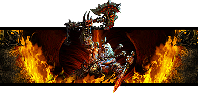
comments/suggestion welcome
Quote Post
Immolation
View user's profile
Send private message
Joined: Aug 11, 2009
Posts: 2530
Posted: Thu May 24, 2012 1:27 pm
It's really good aesthetically. The only thing I would say is that the contrast and sharpness is too high. Perhaps if you lower the saturation.
___________
Fireteam Zulu | Graphics Team Leader | SFC
____________
Quote Post
Silent_Wolf
View user's profile
Send private message
Joined: Apr 03, 2010
Posts: 2971
Location: Loveland, Colorado
Posted: Thu May 24, 2012 1:33 pm
I like the concept, its a great idea. I agree with Immo on this one. theres no focus or direction on the sig. Its all just there.
Quote Post
Post new topic
Reply to topic
printer-friendly view
All times are UTC [DST enabled]
Powered by
phpBB
© 2001, 2006 phpBB Group |
Forums ©