Joined: Nov 03, 2007
Posts: 126
Location: United States
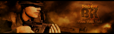
tell me watcha think of it

Joined: Jul 26, 2007
Posts: 239
Location: Washington
Actually put your name in the top left. Something dark toned i think.
*I came, I saw, I conquered!*
*BK* Member since 2004
Joined: Jul 26, 2007
Posts: 209
Location: Norwalk (LA), CA, US
I believe it was you earlier who was asking about the sig. You're off to a good start. Both of the previous suggestions a good ones. I would've suggested the same.
As for the dimensions, I usually use 380x120, but anything in that area will suffice. Yours is a little large at the moment. This is why the site is shrinking it and adding the dotted border. If you still have the original image, I would crop some of the dead space to the left and right of the characters to keep the image from looking stretched. Just try to keep the original ratio...shink it down...and crop the rest.
One other detail that always ties the whole thing together is a border. Doesn't have to be much. Even a simple, 1 pixel border can do wonders. Maybe the same color you choose for the stroke?
SFC.Aryan*BK*