Guest @ 13.59.100.42
Register

Donation


Donate Towards BK`s Servers

Please Donate to Help Keep BKs game server up and running Donate

Server

 
Recent Topics Prev 7   Next 7
Forum
Author
Replies
Last Post
11
Wed May 08, 2024 4:32 pm
Natb1 View latest post
5
Mon May 06, 2024 12:30 am
Luke View latest post
1
Wed May 01, 2024 7:50 pm
Snap71 View latest post
1
Wed May 01, 2024 12:38 am
Natb1 View latest post
0
Fri Apr 19, 2024 12:54 pm
MaxwellSmart View latest post
1
Sat Apr 13, 2024 2:43 pm
Natb1 View latest post
3
Thu Apr 11, 2024 1:10 am
Snap71 View latest post

PstorDan's first shot at a sig...be gentle

Joined: Apr 20, 2009
Posts: 1384
Location: Columbia, MD USA
Posted: Fri Oct 08, 2010 2:54 pm
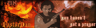
New to the sig world, and new to Photoshop Elements, but what do you think?

Joined: Aug 16, 2010
Posts: 21
Posted: Fri Oct 08, 2010 4:09 pm
I honestly think its pretty cool! Although with that white thing under the neck (you'll have to forgive me as I do not know what its actually called), looks more like a priest in my personal opinion. Perhaps a necklace with a cross on it would be better?


Joined: Apr 20, 2009
Posts: 1384
Location: Columbia, MD USA
Posted: Fri Oct 08, 2010 4:20 pm
Cmedic, very cool idea...I was just trying to come up with something "clergy-like", but I like the cross idea...


Joined: Oct 31, 2009
Posts: 127
Location: Chicago
Posted: Fri Oct 08, 2010 4:48 pm
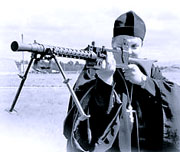
Nice first try, I couldn't do that well. I was curious so did a little google image search. How about incorporating one of these images?

AA


Joined: Aug 16, 2010
Posts: 21
Posted: Fri Oct 08, 2010 5:19 pm
Glad I could be of help!  Very Happy


Joined: Aug 11, 2009
Posts: 2530
Posted: Fri Oct 08, 2010 6:43 pm
you did a pretty good job. One thing I would do is put the priest (or whatever he is) in direct center.


___________Fireteam Zulu | Graphics Team Leader | SFC____________


Joined: Apr 20, 2009
Posts: 1384
Location: Columbia, MD USA
Posted: Fri Oct 08, 2010 8:23 pm
Cmedic, that first pic is HILARIOUS...

Immolation, I think the reason I put the pic off center was to divide the left and right color scheme more definely (sp?), but I will give it a try...


Joined: Aug 11, 2009
Posts: 2530
Posted: Fri Oct 08, 2010 8:25 pm
I can render the second pic that Cmedic posted for you if you'd like.


___________Fireteam Zulu | Graphics Team Leader | SFC____________


Joined: Oct 31, 2009
Posts: 127
Location: Chicago
Posted: Fri Oct 08, 2010 8:57 pm
or Arctic  Sad


Joined: Aug 11, 2009
Posts: 2530
Posted: Fri Oct 08, 2010 9:05 pm
oh woops sorry... I meant Mr.Ant there...


___________Fireteam Zulu | Graphics Team Leader | SFC____________


Joined: Feb 23, 2009
Posts: 1469
Location: Chicago
Posted: Fri Oct 08, 2010 10:28 pm
Nice work Dan! Congrats on your Accomplishment!


Joined: Jul 14, 2009
Posts: 596
Location: Ontario, Canada
Posted: Fri Oct 08, 2010 11:32 pm
Impressive.....I'm lucky if I can even spell photoshup....see  Very Happy


Joined: Jan 03, 2010
Posts: 277
Location: Robins Air Force Base Georgia
Posted: Fri Oct 08, 2010 11:43 pm
I like the Christian theme that prevails here!  Wahoo!!


Joined: Apr 20, 2009
Posts: 1384
Location: Columbia, MD USA
Posted: Fri Oct 08, 2010 11:50 pm
OK, following a few suggestions, here is version 2.  I wanted to keep the image, because it is actually me, cartooned, which I like.

I got rid of the priest collar and put a cross on a chain.

Centered the pic.

Whatcha think now?

Joined: Jul 14, 2009
Posts: 596
Location: Ontario, Canada
Posted: Sat Oct 09, 2010 12:02 am
I remember reading something from WWII during the Japanese campaign in the Pacific, the author interviewed a priest and questioned why as a man of the cloth did he carry a .45 pistol....his answer was " God is quick but the .45 is quicker" I never forgot that statement.....perhaps you could incorporate that with the .45 image I see.  I also preferred the collar...hope this helps.


All times are UTC [DST enabled]
Forums ©