Joined: Dec 05, 2010
Posts: 9
Been a long time since I last did one of these, CC would be nice and be honest please. Thanks
Joined: Aug 19, 2010
Posts: 391
dint no whose that was......had i been able to vote id picked this one...very nice


Joined: Aug 09, 2009
Posts: 501
Location: Texas
You had my vote. Great job man. (yours was good to DH1

)

Joined: Jan 15, 2009
Posts: 1169
Location: Connecticut, USA
this is the one i voted for. I like basically everything about it.
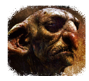
But seeing as you want a critique, i would say that the only thing i am not satisfied with is the blurring on the red knight in the foreground. He's blurred so much that it takes a moment to realize that it is actually a person and not a hill or something that the orc is climbing over. I get that the blurring gets progressively more pronounced as you go out from the orc's face, but maybe back the intensity of a bit?
Its better to see a good render tastefully blended and blurred than a blurred-out image that hints at having been a good render once.
This is just my opinion, and as i have not jumped into the crucible of public critique (i am too much of a perfectionist to ever "finish" any of my works), feel free to completely disregard everything I say.

SSG.Braxis*BK*


Joined: Dec 05, 2010
Posts: 9
this is the one i voted for. I like basically everything about it.
But seeing as you want a critique, i would say that the only thing i am not satisfied with is the blurring on the red knight in the foreground. �He's blurred so much that it takes a moment to realize that it is actually a person and not a hill or something that the orc is climbing over. �I get that the blurring gets progressively more pronounced as you go out from the orc's face, but maybe back the intensity of a bit?
Its better to see a good render tastefully blended and blurred than a blurred-out image that hints at having been a good render once. �
This is just my opinion, and as i have not jumped into the crucible of public critique (i am too much of a perfectionist to ever "finish" any of my works), feel free to completely disregard everything I say. �
SSG.Braxis*BK*
Thank you sir for your thoughts. I should have done more splatter work I was trying to go for a look of "like sand in the wind. I did not want the Knight to be the focus point for this piece that is why less of him is seen. Very little blur was done here I did more smugging than blurring here. I will try an tweak this one a bit more when I find the time. Once again thank you for your thoughts ALL
Joined: Nov 15, 2010
Posts: 614
Location: Denver, Colorado
Maver1ck I would say that time has not dulled your skills much. Very nice work!
To address Braxis's concerns, make a copy of the layer with the knight and then blur it, then erase all that you don't want. Make the edges fuzzy but keep the sharp edges where you want them. Works for me anyway.
Very nice work though!


Joined: Dec 05, 2010
Posts: 9
Playing around with it a bit more not sure I like it now may start over let me know what you think thaks
Joined: Jan 03, 2011
Posts: 58
Location: UK
Remove a little smudging from the original red knight and its 100% from me, down to personal preference and other than that I can't fault it.

Joined: Aug 11, 2009
Posts: 2530