Guest @ 13.59.218.147
Register

Donation


Donate Towards BK`s Servers

Please Donate to Help Keep BKs game server up and running Donate

Server

 
Recent Topics Prev 7   Next 7
Forum
Author
Replies
Last Post
11
Wed May 08, 2024 4:32 pm
Natb1 View latest post
5
Mon May 06, 2024 12:30 am
Luke View latest post
1
Wed May 01, 2024 7:50 pm
Snap71 View latest post
1
Wed May 01, 2024 12:38 am
Natb1 View latest post
0
Fri Apr 19, 2024 12:54 pm
MaxwellSmart View latest post
1
Sat Apr 13, 2024 2:43 pm
Natb1 View latest post
3
Thu Apr 11, 2024 1:10 am
Snap71 View latest post

Signature help/comments

Joined: May 13, 2013
Posts: 386
Location: Sydney/ Australia
Posted: Fri Nov 08, 2013 10:13 am
Silent_Wolf love your work. You inspired me to try and create a sig for myself. Any touch ups or advice appreciated. I wanted something with the Aussie flag in it.
How could I get this as my sig?


[img]http://www.politeandfriendly.com/images/user_bars/tstbarfif.png
Joined: Jun 04, 2011
Posts: 328
Location: Ottawa, Canada
Posted: Fri Nov 08, 2013 1:43 pm
I like it but i would change the Do, or do not, There is no try to an other letter style and maybe an anther color


Joined: May 13, 2013
Posts: 386
Location: Sydney/ Australia
Posted: Fri Nov 08, 2013 2:04 pm
Will try that. Thanks this is the amended version.


[img]http://www.politeandfriendly.com/images/user_bars/tstbarfif.png
Joined: Nov 17, 2010
Posts: 1914
Location: PA
Posted: Fri Nov 08, 2013 3:03 pm
Scatters,
Nice work on your first custom SIG!  

A few pointers and suggestions:
1)  All BK SIGs are 120x400 pixels
2) Main render seems a bit fuzzy?  Do you have a more detailed or cleaner copy that you can use?  I normally start with the most detailed large image that I can find, and then I shrink it down to size.  If the image is not of high quality it will always look blurred when put into a SIG.
3) I would outline your "do, or do not..." text with a dark color, and then make the background behind the letters darker so they pop.
4) Play with some shadowing/lighting work behind the main soldier so he blends into the SIG better
5) We normally do not put the webpage on finished SIGs, (just ones that have not been claimed)... but it is a personal preference so please keep it if you like it on there!

Overall I like the layout and the flow!  Good Job!


Joined: May 13, 2013
Posts: 386
Location: Sydney/ Australia
Posted: Fri Nov 08, 2013 3:32 pm
Thanks Kulamonster, will play around a bit more. I now know your efforts in your creations.


[img]http://www.politeandfriendly.com/images/user_bars/tstbarfif.png
Joined: Nov 17, 2010
Posts: 1914
Location: PA
Posted: Fri Nov 08, 2013 3:50 pm
Something a long the lines of this:


You can see some of the subtleties I added, and also that I picked an actual picture of an Aussie soldier and made a custom render from that, so it has more detail.
If you need anymore tips just let the graphics team know, we are always willing to help out!

CHEERS!!


Joined: Apr 03, 2010
Posts: 2971
Location: Loveland, Colorado
Posted: Fri Nov 08, 2013 4:06 pm
Sorry, I just missed this whole thing.

I fully agree with the suggestion that Kula made. As he mention, one of my biggest pet peeves is to keep things uniform.  A uniformed unit is a strong unit.  So we want to keep all main portions of a sig at 400x120, not 120x400.  That would make the sig tall and skinny, not short and fat.   Razz  Sorry Kula, had to pick on you about that one.  

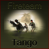
1) To me the sig lacks focus.  "Your focus needs more focus"  Sorry I totally love that quote.
2) The main render seems distant.  If that was your intentions, then Kula is 100% right.  The solder is too pixelated and I could be wrong, but I think the rest of his barrel is missing.  The concept of the sniper is great, I personally would make him larger to cover more of the sig with his upper body.
3) You did a great job with some lighting effects.  The shadowing on the button right and left fading up is great.  I honestly dont see many problems with what you have there, but you can use some more to help tie things in.
4)The text:  Kula is spot on again.  The quote gets lost in the background and make it difficult to read at first glance.  A few things you can do to correct that.  Either choose a different color which will help it come out a little or my favorite thing to do, have the color you want, but put a border around it to help it stick out. You can see that effect on your current sig, I have the black letter, which was getting lost in the background, so I put a white blurred border to help it not get lost.  Im thinking there is another quote to use, just because Im in a playful mood this morning " Are you a Mexican or a Mexican't "  I just love that part.
5) The name is weird to me, Im not sure if you have the yellow and then there is a black text behind it, but if you were trying to do that, its an awesome effect, but what ever is behind it needs some help to come out. Not much, but just enough to say, "Hi, Im here"  Beyond that I think you nailed it.
6) the website address.  Everything is perfect there except, I think it would look better if it was all in the same caps.  But thats just me.
7) Last but not least; The background.  You have an awesome concept, but I think it would help your focus out a little if you gave it an ever so slight blur.  Once the render is fixed up to have a sharper look to it, adding a blur will help that out.

Overall you have a awesome concept here with great potential and remember, these are just suggestions and if any of this is a stick in the eye, I apologize, that was not my intention.  

If you want some more hint or help, please feel free to ask Kula or I for anything.  Im always here for that and not only does it help others but helps me too.  Trust me, I am by far not the best at graphics and I love to learn more myself.


Joined: May 13, 2013
Posts: 386
Location: Sydney/ Australia
Posted: Fri Nov 08, 2013 4:11 pm
You never cease to amaze, Kula. I will keep trying until I understand the process properly. That's a nice Sig.

Silent thanks for the feed back. All advice will be taken in, and no offence taken. Appreciate your time.


[img]http://www.politeandfriendly.com/images/user_bars/tstbarfif.png
Joined: May 13, 2013
Posts: 386
Location: Sydney/ Australia
Posted: Fri Nov 08, 2013 8:18 pm
I hope you like my sig. Will improve over time. Thanks for all the support from the graphics team. It's great having you guys there.


[img]http://www.politeandfriendly.com/images/user_bars/tstbarfif.png
Joined: Apr 03, 2010
Posts: 2971
Location: Loveland, Colorado
Posted: Fri Nov 08, 2013 8:30 pm
I like where you are going with this. The primary render still has some issues in my opinion.  Its misformed, like you when you resized it, it wasnt done evenly and the resolution is still low.

As for the rest, you did a much better job on the background and the addons.  

With some toying around, I think this would really turn out great.


Joined: May 13, 2013
Posts: 386
Location: Sydney/ Australia
Posted: Fri Nov 08, 2013 8:41 pm
Getting there, trying to play around with your suggestions. Gets frustrating sometimes when you add something and just doesn't work. LOL


[img]http://www.politeandfriendly.com/images/user_bars/tstbarfif.png
Joined: Nov 17, 2010
Posts: 1914
Location: PA
Posted: Fri Nov 08, 2013 9:03 pm
I feel your pain Scatters!  Been there, done that a lot....sometimes everything clicks right into place, and at other times, no matter what you do, it doesn't work!  You just have to have patience with it, and sometimes the best thing you can do, is to walk a way from it for a day or two, and then come back and take a fresh look at it!  

I like the changes that you have made and the direction your SIG is headed!  I agree with Silent that the main render is still off, and a bit pixel-lated.  (Just ask Silent, I still have issues with shrinking images and getting them to look right...LOL.)    Keep up the great work!!


Joined: May 13, 2013
Posts: 386
Location: Sydney/ Australia
Posted: Sun Nov 10, 2013 6:12 am
Can Kulamonster or Silent_Wolf  advise me on a good graphics programme to use. I'm getting head aches
from this, but slowly understanding the concept.


[img]http://www.politeandfriendly.com/images/user_bars/tstbarfif.png
Joined: May 31, 2011
Posts: 2631
Location: Fort McMurray, AB
Posted: Sun Nov 10, 2013 6:17 am
Give GIMP a shot. As advanced as Photoshop but it's free.

www.gimp.org/?

There are many guides and tutorial videos or it, as well.


-- Of all the soles I've ever tasted, his had the most   ....cumin. --
Joined: May 13, 2013
Posts: 386
Location: Sydney/ Australia
Posted: Sun Nov 10, 2013 7:55 am
Thanks Abram, will give it a go.


[img]http://www.politeandfriendly.com/images/user_bars/tstbarfif.png
All times are UTC [DST enabled]
Forums ©