Joined: Nov 27, 2010
Posts: 81
These are only a few of the gallery as i'm due to finish the graphics website within the new year which will have all the graphics i've made on it. This is a few of what i've made in the past for some examples and a most recent one which i made just about 5 minutes ago.
Please comment and rate all tips are appreciated
Very old portrait picture i made about a month or 2 ago

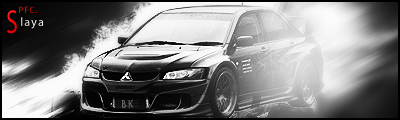
Car sig made just 5 minutes ago

Version 2
Rest of the graphics


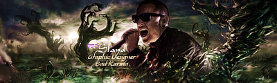
This is a banner i made for a radio station i used to present on.


Tango Squad
Joined: Mar 13, 2009
Posts: 3070
Joined: Nov 27, 2010
Posts: 81
Haha thats a wall he's leaning on

Tango Squad
Joined: Aug 11, 2009
Posts: 2530
They all look great! Keep that in mind as I give you suggestions.
The first one seems like there's too much contrast... and I'm not sure I like the positioning of the render.
The second and third seem sorta empty. Feels like there should be more brushes or somethin. And the light glare on the right side seems a bit too much.
The fourth looks really good, although I think the face pops out too much.
The fifth looks weird, because as Ladyhawk said, it looks like his ear is being cut off. It's a bit hard to tell that there's a wall there.
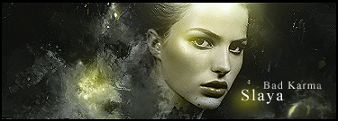
The sixth I really like. I think I found something with the lighting though. It seems like the background is lighter to the left of the girls head, but then once you get really close to the head, it gets dark again. And I think the lighting should be more on the top of the head then down by the chin.
Hope this helps, and great work!
___________Fireteam Zulu | Graphics Team Leader | SFC____________


Joined: Nov 27, 2010
Posts: 81
Well thanks Immolation the Prison Break one wasn't originally going to be a signature. It was a banner for my website to give an example of what banners look like and used for. The glare on the car signature sig is ment to be there as it shows it's going fast and coming out of the signature but yes the glare can be changed. And the darkened section on the last sig is also ment to be there as it's her shadow. The light can't follow throughout the whole signature as it would look weird. She is looking up into the light and the dark behind her is where the light can't get it so therefore a shadow. But thanks for your comments i take em all into consideration

Tango Squad
Joined: Dec 11, 2009
Posts: 794
Location: Dyer,Indiana
Joined: Nov 27, 2010
Posts: 81
Well i was going to. But if i've been kicked out i don't think i would be allowed to participate.

Tango Squad
Joined: Dec 11, 2009
Posts: 794
Location: Dyer,Indiana
Joined: Aug 11, 2009
Posts: 2530
Joined: Aug 09, 2009
Posts: 501
Location: Texas
Immolation wrote (View Post):
He might want it to be BK members only.
So I'm out on this one this time? Resolve and post decision soon please as we only have a few days to knock these out. Thanks, HB.


